CU DC: Meet The Team Interaction
MEET THE TEAM
Where It Started — A Template, A Discovery, and a Lesson in States
Staff Introduction Interaction | Hotspots, Photo Reveals & Triggers
DESIGNER’S STATEMENT
This is an early project. I’m including it because every portfolio should have one — something that shows where the work began, not just where it is now.
I built this during my master’s program, early in my Storyline years, as part of a larger software training curriculum for the CU Boulder Distribution Center. The interaction itself came from an Articulate template. What didn’t come from the template was the part I’m most proud of: figuring out how to use Storyline’s States feature to flip each team member’s photo from black and white to full color on hover and click. Color as the reward state. Recognition as the mechanic. Eleven people, each with a short description of their role and their history with the team.
It was a small discovery. It turned out to be a foundational one. The trigger-based logic I worked out on this project — States, hover conditions, click reveals — shows up in every interaction I’ve built since. The Surplus Property Adventure’s building color changes. The Measurable Maze tile feedback. The Cognitive Conundrum cart placements. All of it traces back, at least in part, to figuring out States on this project.
I’d design it differently today. But I wouldn’t skip it.

PROJECT OVERVIEW
| Overview Item | Description |
|---|---|
| Type | Staff Introduction Interaction |
| Audience | New and existing campus staff; general public (website version) |
| Platform | Articulate Storyline (HTML5) — deployed in Canvas LMS course and on public website |
| Tools Used | Articulate Storyline, Photoshop (image editing) |
| Team Size | 11 Distribution Center staff members |
| Deliverables | Storyline interaction (privacy version for portfolio; full version in course and on public website) |
| Status | Completed — part of the AssetWorks blended training curriculum |
| Role | Instructional Designer, eLearning Developer |
PROJECT OVERVIEW
The Challenge
The Distribution Center staff worked with campus property managers who often didn’t know who they were calling or emailing. Building familiarity between the DC team and the campus community they served was a genuine need — and the existing solution was a static org chart.
The interaction needed to work in two contexts simultaneously: embedded inside the AssetWorks Canvas training course for new users learning the system, and published as a standalone HTML page on the public Distribution Center website so anyone on campus could access it. That dual deployment ruled out SCORM tracking and meant the interaction had to function cleanly as both course component and public resource.
Privacy was also a real constraint. The full version — with actual staff photographs and job information — couldn’t be published in the portfolio. A privacy-preserving version with placeholder characters was built for public portfolio use.
The Solution
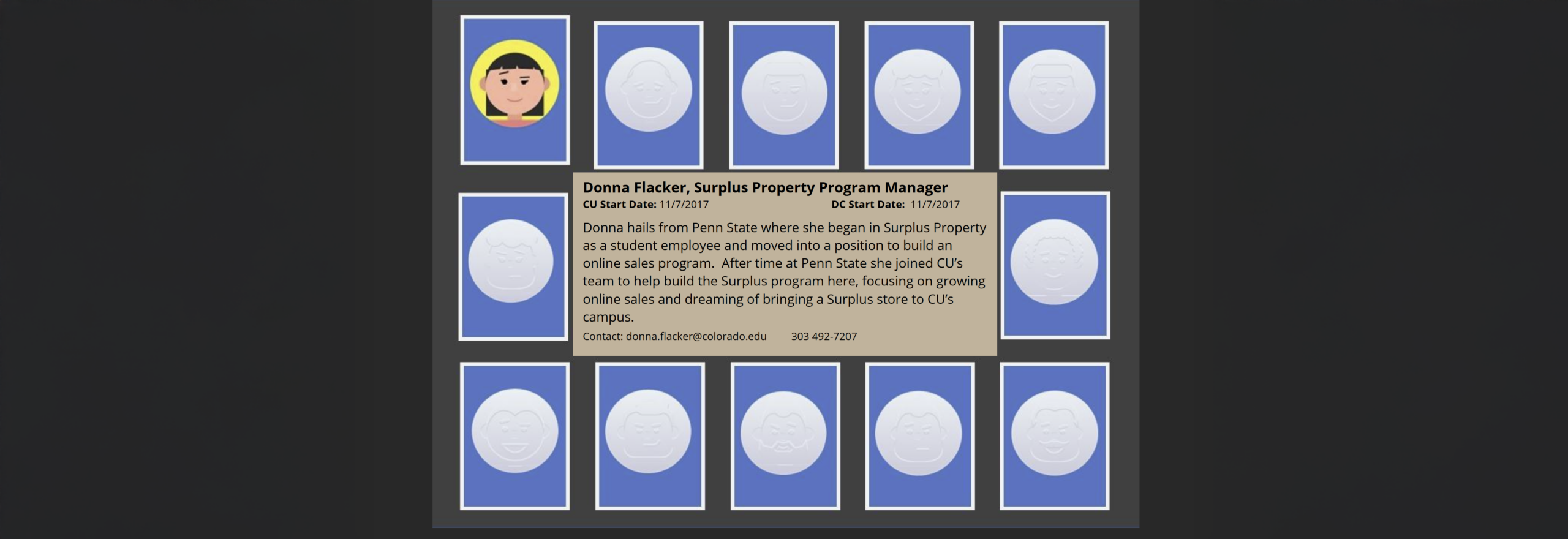
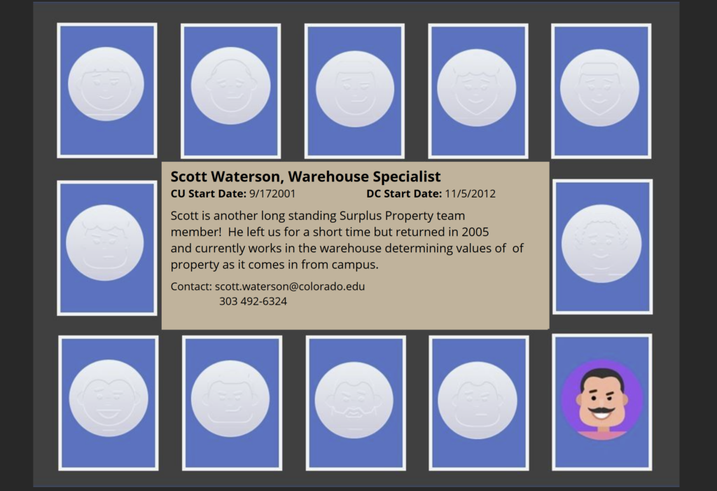
A flip-card style interaction adapted from an Articulate Storyline template, extended with custom States logic to create a hover-and-reveal experience.
Each of the 11 team member cards displayed a black-and-white photo by default. Hovering over a card triggered a State change that revealed the full-color version of the photo — color as the reward state, recognition as the moment of engagement. Clicking the card revealed a short description of the team member’s role, responsibilities, and history with the Distribution Center.
The interaction was published as HTML5 and deployed in two places: inside the Canvas course as a standalone module for new users, and on the public Distribution Center website for general campus access.
Impact / Outcomes
- Replaced a static org chart with an engaging, interactive staff introduction
- Served dual audiences — course learners and general public — from a single build
- Built familiarity between campus staff and the Distribution Center team they’d be working with
- Established the trigger-based design patterns that carried forward into more complex projects
DESIGN DECISIONS
Decision 1: Color as the Reward State
The default state for each photo was black and white. Hover and click revealed full color. This was an intentional UX choice — color feels like a discovery, a small moment of delight that rewards engagement. It also creates a subtle visual hierarchy: the grid at rest is calm and scannable; the active card pops. Getting this right early, instinctively, was a signal worth noting.
Decision 2: Extend the Template, Don’t Just Use It
The Articulate template provided the flip-card structure. The States logic — particularly the hover-triggered color reveal — was custom work built on top of it. This distinction matters: template-following produces cookie-cutter output; template-extending produces something that fits the actual need. Learning to see templates as starting points rather than finished solutions was one of the most valuable lessons this project taught.
Decision 3: Build for Dual Deployment from the Start
Knowing the interaction would live both inside a Canvas course and on a public website shaped every decision — no SCORM tracking, clean HTML5 output, no course-shell dependencies. Designing for deployment context rather than just for the authoring tool is a habit this project helped establish.
Decision 4: Design with SMEs Who Didn’t Know They Were SMEs
The ten people on the Surplus Property team were process experts, not instructional design collaborators. One of the most valuable parts of this project was facilitating discovery conversations that helped them articulate knowledge they’d never had to explain before — the unwritten rules, the edge cases, the “we’ve always just done it this way” decisions that turned out to be policy-critical. That process was as much organizational knowledge management as it was course design.
WHAT I’D DO DIFFERENTLY
Add audio introductions. A short clip of each person saying hello and describing their role would be far more humanizing than text alone. The whole point of the interaction is familiarity — voice gets there faster than a paragraph.
Reframe the descriptions around the learner. “Here’s what I do” is less useful than “Here’s how I can help you.” Orienting each staff description around the campus user’s perspective would make the interaction genuinely useful rather than just informative.
Design for touch from the start. Hover interactions don’t translate to touchscreens. With dual deployment across a course and a public website, mobile users would miss the color-reveal mechanic entirely. Today I’d design the interaction state to work on tap rather than hover — or build separate touch-friendly logic.
Think about maintenance at build time. Eleven staff cards sounds manageable until someone leaves and a new person joins. Rebuilding a Storyline card every time there’s staff turnover isn’t sustainable. Today I’d either build in a simpler update mechanism or consider whether a different tool — a Rise labeled graphic, a simple webpage — would be easier to maintain long-term.
TECHNICAL SPECIFICATIONS
| Overview Item | Description |
|---|---|
| Authoring Tool | Articulate Storyline |
| Interaction Type | Flip card with hover and click states |
| Key Feature | States-based photo reveal — black/white default, full color on hover/click |
| Team Size | 11 staff members |
| Output Format | HTML5 (no SCORM — dual deployment to Canvas course and public website) |
| Privacy | Full version with real photos in course/website; placeholder version in portfolio |
| ID Concepts | States, triggers, hover conditions, dual-context deployment |
| Project Era | Master’s program — foundational Storyline work |